There are a ton of different definitions of what constitutes an endgame in the mainline Pokémon franchise. Many of them are endeavours invented by the fanbase themselves to make up for the lack of any actual meaningful things to do from the developers themselves. But that’s neither here nor there. No, one of the big pastimes for many hardcore Pokémon fans is the collection and trade of “Shinies”.
In case you didn’t know, the concept of Shiny Pokémon was introduced in the second generation. In Gold and Silver, the concept was showcased through the red Gyarados encountered in the Lake of Rage. What many people didn’t realise at the time was that every Pokémon in the game has an alternate coloured form. Something not many people would have encountered at all due to how rare of an occurrence it was.
Also, in part due to just how bad some of those early shiny forms were. Sure, there were some distinct ones such as Gyarados, but for the most part, a lot of the Pokémon were only a slight shade different from their original colour. There’s actually a reason for this. In the early days, Pokémon had very limited colour pallets. Only a couple of colours on top of black and white. Which meant there wasn’t much wiggle room in terms of changing them to a new colour.
Plus, hand choosing a new colour for all 251 Pokémon was such a slog that Game Freak decided to automate the whole thing. Just shifting the Pokémon’s colour to the next pallet in the system. Which is why you get some bizarrely chosen colours that make some Pokémon look great and others look like ass.
Let’s have a look at some of examples of my ones I really like from the first generation while I spend further time talking about it:
Best:
Charizard

Charizard is the most iconic, getting it right example I can think of from the first 151 Pokémon. From a personal standpoint I hold onto bunch of my own rules for whether or not I determine a Pokémon has a good shiny or not. The first of which states that the colour change actually change to a different colour, rather than into a different shade of the same colour. And you struggle to go wrong with wither black or white in my opinion.
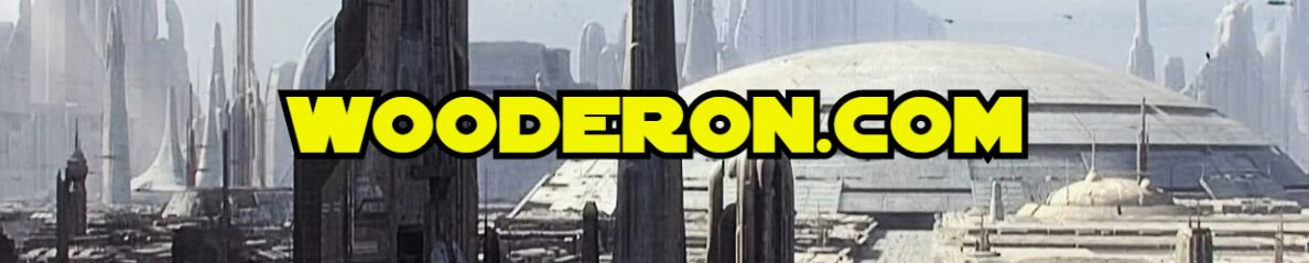
Dugtrio
The second of my rules is that you change at least one of the two primary colours of the Pokémon to something different. While totally changing the colour of a Pokémon can be fun, just changing one aspect of it is cool too, Like with Dugtrio. I placed the original gold and silver shiny sprite in there for comparison as well so you could see just how the original algorithm changes the whole sprite, meaning the soil below the Pokémon changed colour too.
Ponyta

Like Dugtrio, Ponyta just changes one aspect of the Pokémon; it’s flames. And it’s to great effect. While recolouring all of the Pokémon would have been cool, just the blue flames makes it more striking.
Weezing

I think Weezing might be the best example of a Pokemon that benefitted from the algorithm. While the green body is a colour I like, it’s the purple smoke that really makes this one stick out to me. Something I don’t think would have been the case had this been a design made by people.
Magneton

Magneton is a benefactor of the third and least used rule of my personal, arbitrary rule for determining what makes a good Pokémon shiny: And that is that not all colours need to change in tandem. on the surface, the shiny form of Magneton might seem duller. Having less colour to it, but the the similar black and white colour scheme in addition to the removal to the coloured ends of the magnets makes the Pokémon look far more distinct from it’s original form that it could have otherwise.
I also had example of Mew, Golbat and Electrode. But by this point I think you get what I’m coming from when it comes to liking shiny Pokémon, because there are just so many bad ones. While the restriction of simple colour pallets where gone by the time we got to Gen 3 on the Gameboy Advance, Game Freak decided to stick with their established system. Meaning we continues to get code generated shiny form for the first five Pokémon Generations.
It wasn’t until the polygonal games on 3DS that they started to actually design the alternative forms themselves. Sticking to whole pallet changes in X & Y and finally deciding to get more artististic with it in Sun & Moon and actually pick and chose which aspects of the Pokémon they wanted to change the colour on.
So, for a bit of fun, I’m going to list what I feel to be the worst casualties of the system in the first Pokémon generation and have a go at something different by using my own rules about shinies and the post-Gen 7 approach to creating Pokémon shinies.
Worst:
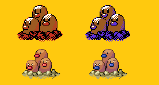
Gengar
Is this a sore spot amongst some fans? Gengar is very much a fan favourite. And yet his Shiny form it terrible, it’s hardly that different than his usual colour. You’d be forgiven for not even realising it was a shiny without being told so. Made all the worse by the fact that his prior evolutions are very distinctly different. Game Freak seemed to realise this, when they actually gave Mega Gengar a totally different colour scheme. Which is the basis of the original sprite I have made here, using the same colour pallet that Mega Gengar uses.
Golduck

As I just mentioned with Gengar, there are a lot of cases in the older games where certain Pokémon in an evolutionary line have great shinies, while others have terrible ones. While Shiny Charizard looks badass, Charmander and Charmeleon get short shrift. Golduck has the opposite problem in that Psyduck looks great; exhibiting various shades of baby blue. However, Golduck just turns a slightly different shade of blue. Very disappointing. So in my original sprite I thought, why not swap those colours round and use Psyduck’s original colours on his evolved form.
Snorlax

What is Snorlax supposed to be? A Bear? That was kind of my original idea when it came to this one. Again, Snorlax has a terrible shiny, a slightly different shade of his original colour. So in my approach I just flipped two of his most primary colours: The brown of his feet and the blue of his body. I really do like brown as a colour, and this Snorlax works for me. It makes him all the warmer and friendlier.
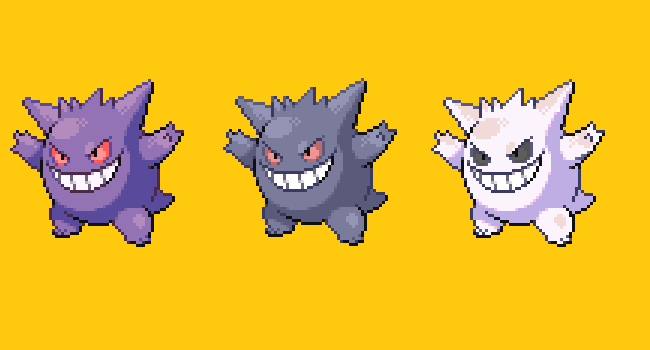
Seaking

Is there a more forgettable Pokémon from the original 150 than Seaking? Not really helped by his shiny form; another which you might not realise is even a shiny if it weren’t pointed out to you. Seaking is one of those strange examples of a Pokémon whose shiny seemed to change as the generations went on. In the second and third generations, its shiny had a much more yellow/gold colourisation to it. For some reason changing to a duller orange in Diamond and Pearl.
For my own shiny I struggled to decide on what to do with it. So, like with Snorlax I decided to just flip around some of the colours that already exist on the Pokémon rather than introduce any new ones. Basing it loosely on one of my own Goldfish while doing so. It certainly looks distinct, although I’m not sure if this one works as well. What do you think?
Parasect
I’m actually kind of surprised I didn’t end up having any examples of it here, but I found that a lot of the bad shiny Pokémon from the original few games had a tendency towards being green. Maybe it’s how the colour pallet worked, but there were so many Shiny Pokémon that took on dull shades of green to them. While Shiny Parasect doesn’t have that, it might as well for how it ends up looking like a washed out version of the original, left in the sun too long.
When making my own alternative, I was torn about which aspect of the Pokémon to change. I did some searching online until I came across the Violet Webcap, a purple coloured mushroom of pretty vibrant colour. So that became the inspiration for this version of Parasect, where it has a different species of invasive fungus invading it’s body. Much to the same effect.
Zapdos

Zapdos is arguably the coolest of the Legendary birds. Including those introduced later on. Y’know what else are cool? Ravens. So, in my pursuit to make my own version of Shiny Charizard, I ended up with Raven coloured Zapdos. Because anything would have been better than the alternative. Of the original 150, Electric types either got an incredibly raw deal or got amazing colour schemes. There didn’t seem to be any in-between.
Pikachu

How is it the mascot of the entire franchise has such a bad shiny form? When I first started doing this, I knew I was going to have to do something with Pikachu, and shockingly it was the Pokémon I struggled to come up with an alternative the most out of this entire experiment.
I thought about making him blue to reference the whole “Pikablu” rumour back before Gold and Silver came out, I thought about just changing the colour of his cheeks, but that never looked great either. In the end of ran with the idea of a Lab mouse as well as running with the idea that black and/or white colour schemes rarely look bad. And I actually think this one looks pretty good the more I look at it.
While Game Freak are getting more creative with their new Shiny Pokémon, the older ones still suffer from having some terrible alternative colour schemes thanks to the random method with which they were created. From a personal standpoint, I don’t see there being any reason for them to redesign some of the shiny sprites for older Pokémon and just shrug to the audience and say that they’re regional variants.
Just variants less extreme than the ones that change their typing and appearance.
I had fun doing this as something a little different. In the end I had to limit myself to just the first generation of this post, and even then there were probably a dozen or so more Pokémon I could have highlighted both on the great and on the bad side of this post. I might do this again with Gen 2 Pokémon in the future, as colouring sprites turned out to be much easier to do than I’d first expected. Please tell me what you think and what you think of my terrib-great design sense.

Ponyta is one of my all time favourite shinies, I just love those blue flames!
I also agree that some of the worst/most disappointing shinies are the ones where they are just a slightly different shade of the same colour, making it hard to tell that they’re even shiny at all.
LikeLiked by 2 people
I always had a soft spot for the Zubat line. In part because it was the first shiny I ever consciously caught. The weird thing was after catching the Zubat at the start, I encountered another shiny Golbat in Victory Road. I have no idea what the odds of that happening
While I complain about green shinies in the post, the fact that it turns bright pink once it evolves into Crobat is amazing to me.
LikeLiked by 1 person